Handbook / STS — the Sage Trading System
Two charts — 15-minute and 3-minute
The 15-minute chart tells you which way to look. The 3-minute chart tells you when to get in.
In one sentence
The 15-minute chart shows the bigger picture, and the 3-minute chart shows the exact entry.
Why it matters
A trade can look great on a fast chart while the bigger picture points the other way. Those trades often fail.
When both charts agree, you are trading with the bigger move instead of against it.
Do this
- Open the 15-minute chart first. Is price making higher highs and higher lows (going up), or lower ones (going down)?
- Only look for buys when the 15-minute is going up or turning up. Only look for sells when it is going down or turning down.
- Drop to the 3-minute chart to find your level, your QPulse cross and your Flow Pro check.
- If the two charts disagree, skip the trade.
Real example
This teaching diagram shows the flow from the bigger chart to the entry. It is not a real trade.
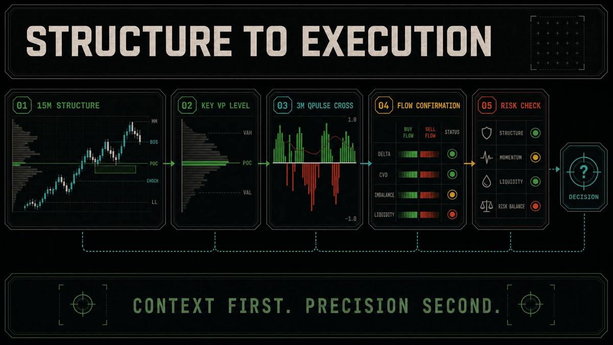
From Sage's STS notes: "The 3m tells you the entry. The 15m tells you if you should be looking for entries at all."
Common mistakes
- Only looking at the fast chart. It hides the bigger trend.
- Going even faster. Sage's notes say that if you look at 1-minute charts, you are trading too much.
- Going much slower. If you use 1-hour charts, you are swing trading, not day trading.